Logo Process
To begin this Branding project I started with a word list, exploring everything I could regarding tattoo parlors. I eventually landed on an oceanic theme. I went into a research phase which led me into a rabbit hole of the long history behind sailing and tattoo culture.
I quickly finalized a name after my research on maritime life, Oceanic Ink. This would act as a guide for the logo process. I would focus on something that bridges the gap between life at sea and tattoo culture as it is known today.


Once I had my name, I launched into thumbnails, exploring a variety of styles to move forward with. The core of this brand was to incorporate the long history that both tattooing and sailing has had in common, so I tried to find one that would fit that mold.


After choosing a few good candidates I tried them out digitally, or rendered them up more by hand and explored my typographic choices. I was getting a sense of what approach would be best for this kind of design, and what layout would look great too.

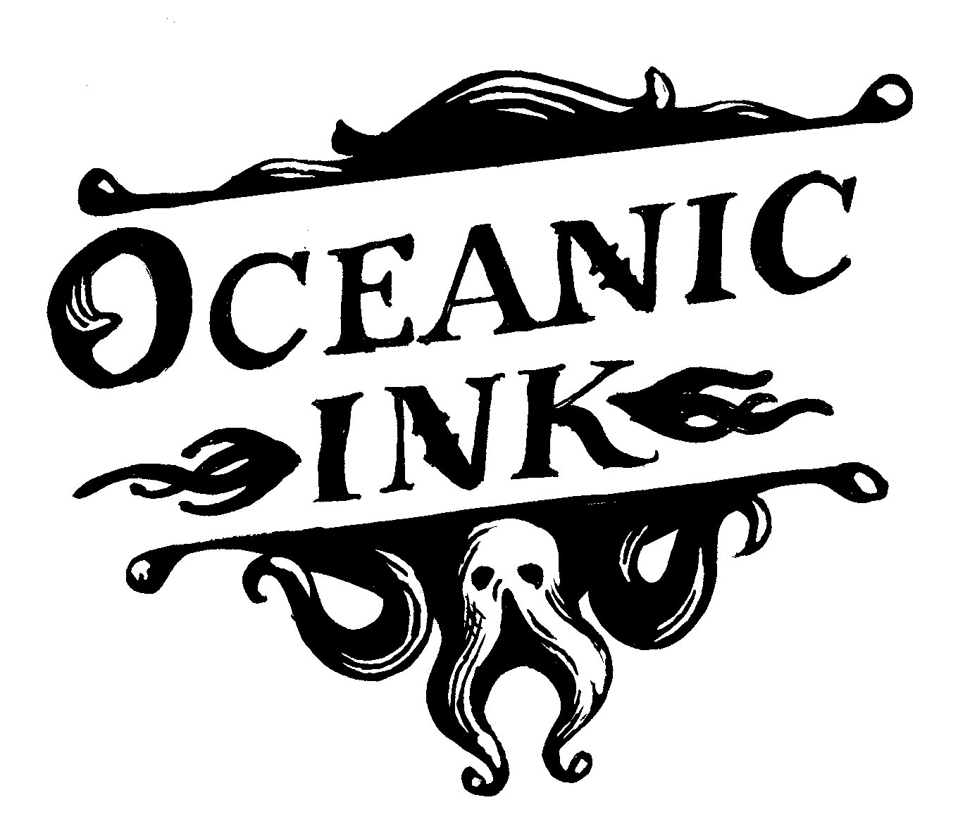
I chose a serif typeface which made it appear with more historic significance. Along with that I included floral scrolls which emphasized that historic nature. Octopus tendrils gave a sense of fantastical thrill, the sea, and and illustration that tattoos are known for.


Final Logo

